The Role of Typography in Packaging Design
Posted by
admin

The Role of Typography in Packaging Design
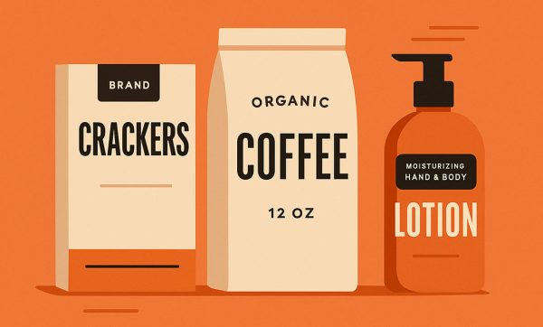
When it comes to packaging design, most people think of colors, logos, and imagery. But typography—the art and technique of arranging type—often plays an equally powerful role in how consumers perceive a product. The right choice of font, size, and placement can make packaging stand out on shelves, communicate brand values, and influence purchasing decisions.
1. First Impressions Matter
Typography is often the first thing a customer notices when they look at a package. A bold, clean typeface can convey confidence and modernity, while a script or handwritten font can suggest elegance, luxury, or a handcrafted feel. The way text is styled helps set the tone for the brand before a customer even reads the words.
2. Communicating Brand Personality
Every brand has a personality—whether it’s playful, minimalistic, premium, or eco-conscious. Typography serves as a visual language that expresses these traits. For example:
-
Sans-serif fonts feel modern and minimal.
-
Serif fonts convey tradition and reliability.
-
Custom or hand-drawn fonts create uniqueness and memorability.
A mismatch between font style and brand identity can confuse customers and weaken brand recognition.
3. Enhancing Readability and Clarity
A product's name, features, and instructions must be easy to read, especially from a distance. Clear, well-spaced typography ensures that essential information is accessible at a glance. This is especially important in competitive retail environments where shoppers quickly scan shelves.
4. Creating Visual Hierarchy
Typography helps organize information on packaging by guiding the eye to the most important details first. Through variations in size, weight, and color, designers can make the product name, flavor, or key selling points stand out, while secondary details remain visible but less dominant.
5. Differentiating from Competitors
In a crowded market, distinctive typography can become a brand’s signature. Think of Coca-Cola’s iconic script or FedEx’s clean and bold lettering. A unique type treatment can make packaging instantly recognizable and memorable.
6. Emotional Connection
Fonts evoke emotions. Rounded, soft typefaces may feel friendly and approachable, while sharp, angular fonts might feel edgy and bold. By using typography strategically, brands can tap into a customer's emotions and create a stronger connection.
Final Thoughts
Typography is not just about making words look good—it’s about making them work for your brand. In packaging design, it serves as a bridge between visual aesthetics and brand messaging. Whether you’re launching a luxury skincare product, a playful snack brand, or an eco-friendly household item, the right typography can elevate your packaging and strengthen your brand’s identity.
Share:
Latest Posts

The Future of Custom Packaging: 2025 Trends to Watch


How Custom Boxes Can Increase Your Brand’s Repeat Sales
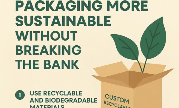
5 Ways to Make Your Packaging More Sustainable Without Breaking the Bank
The Role of Typography in Packaging Design